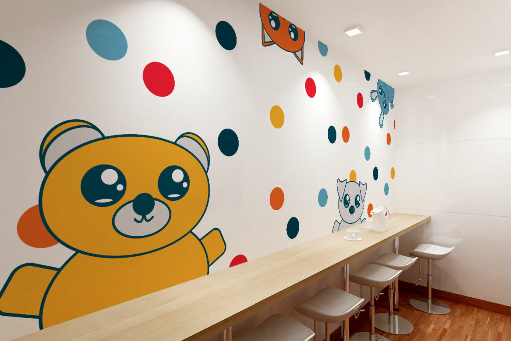
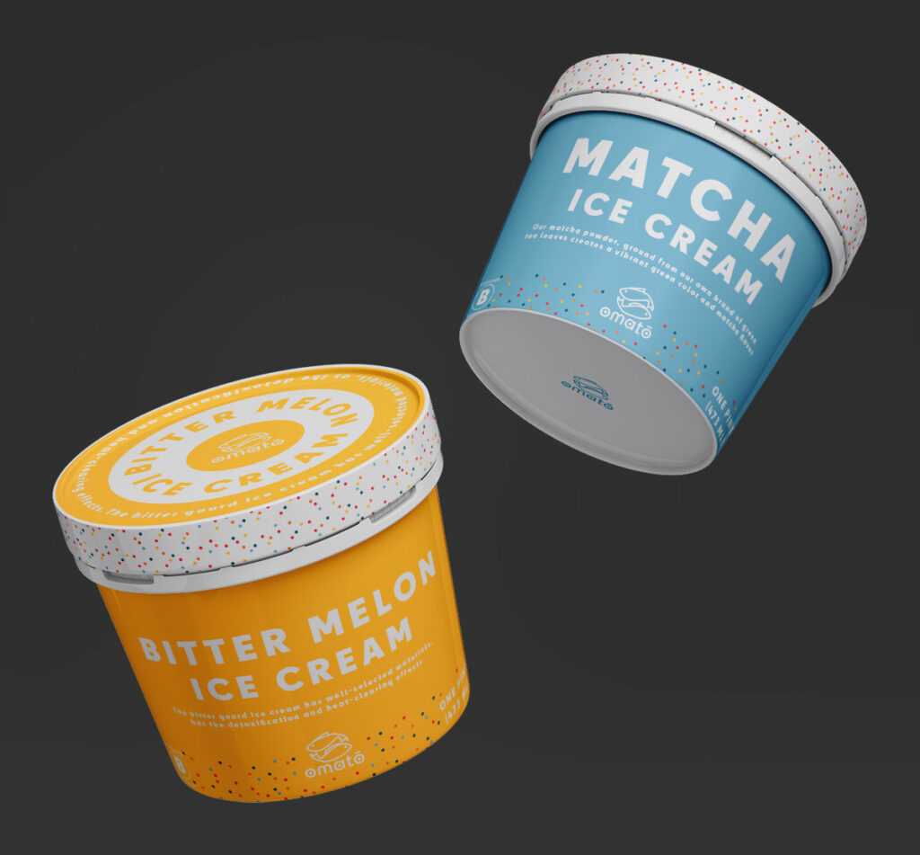
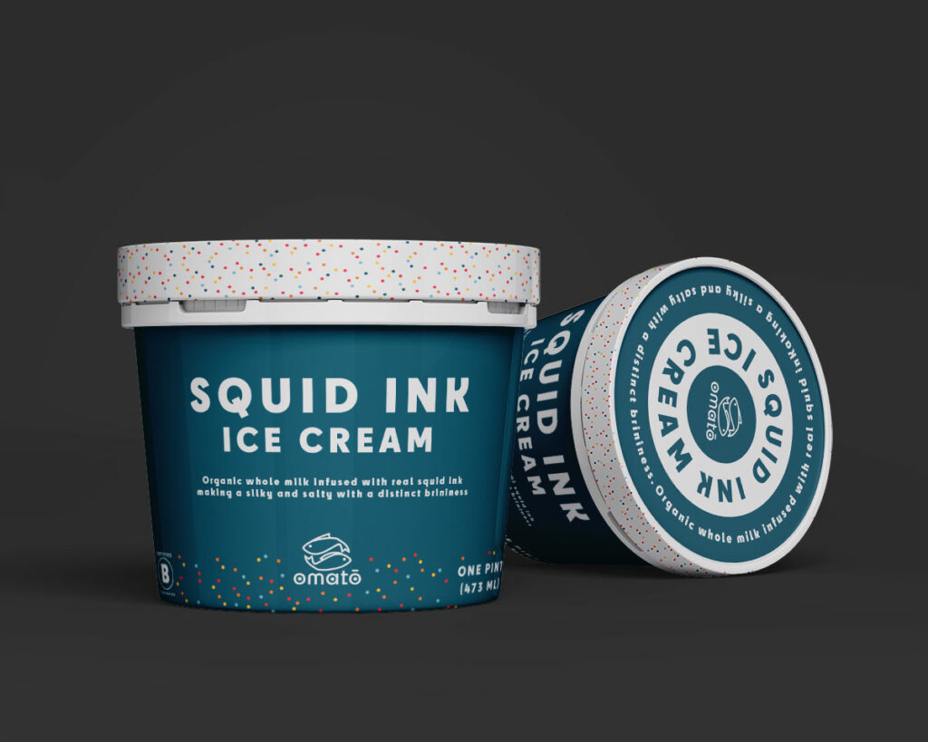
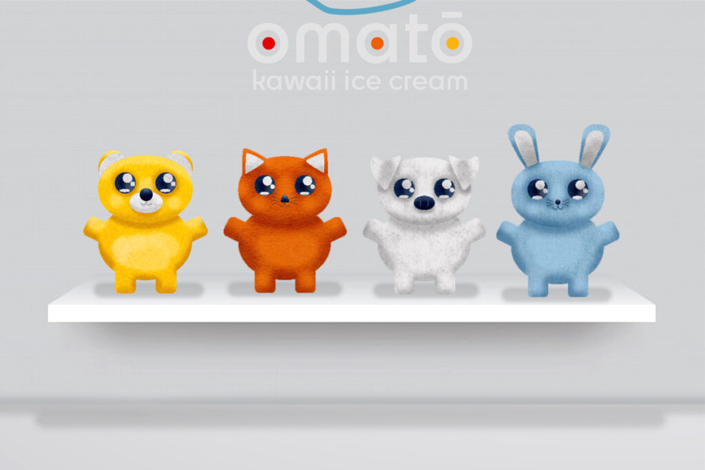
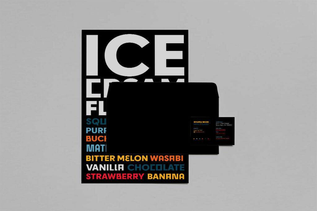
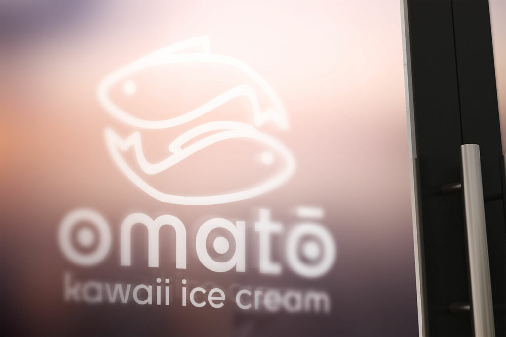
When thinking of Japanese restaurants in the U.S., traditional cultural designs and clean, minimalist layouts often come to mind. For this project, I wanted to break away from convention and create something entirely different. Drawing inspiration from Japan’s playful kawaii culture, I envisioned a vibrant ice cream shop where students can gather and enjoy a cheerful, quirky atmosphere. The shop features bright colors, whimsical designs, and original, adorable characters that double as snack toppings. Paired with wacky, unconventional ice cream flavors, this concept transforms every visit into a fun and unforgettable experience.
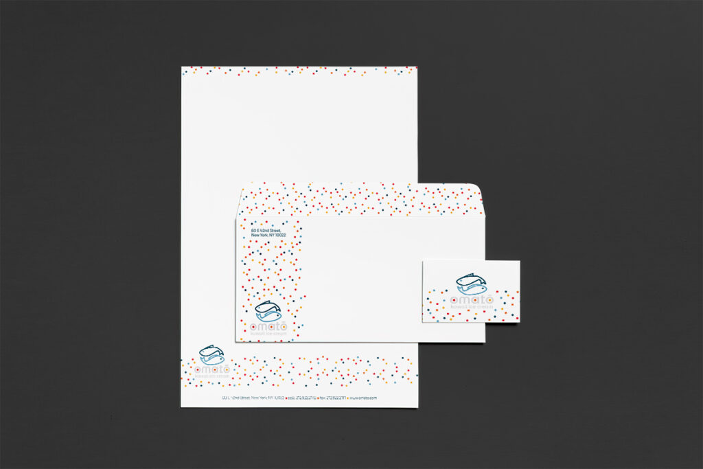
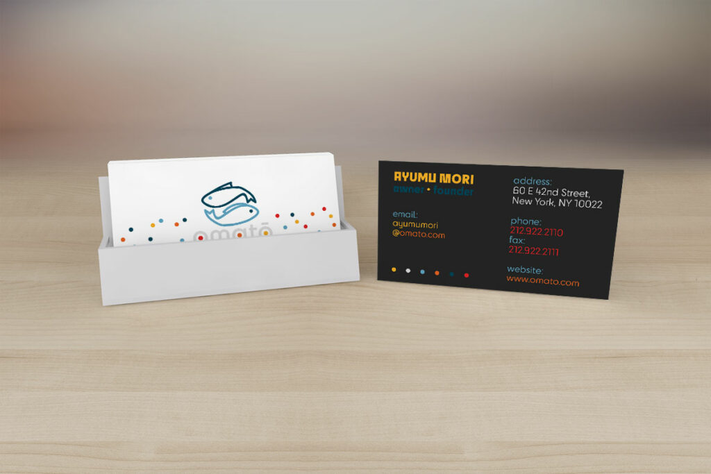
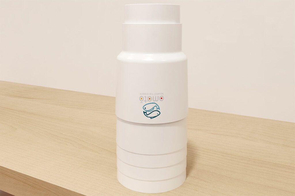
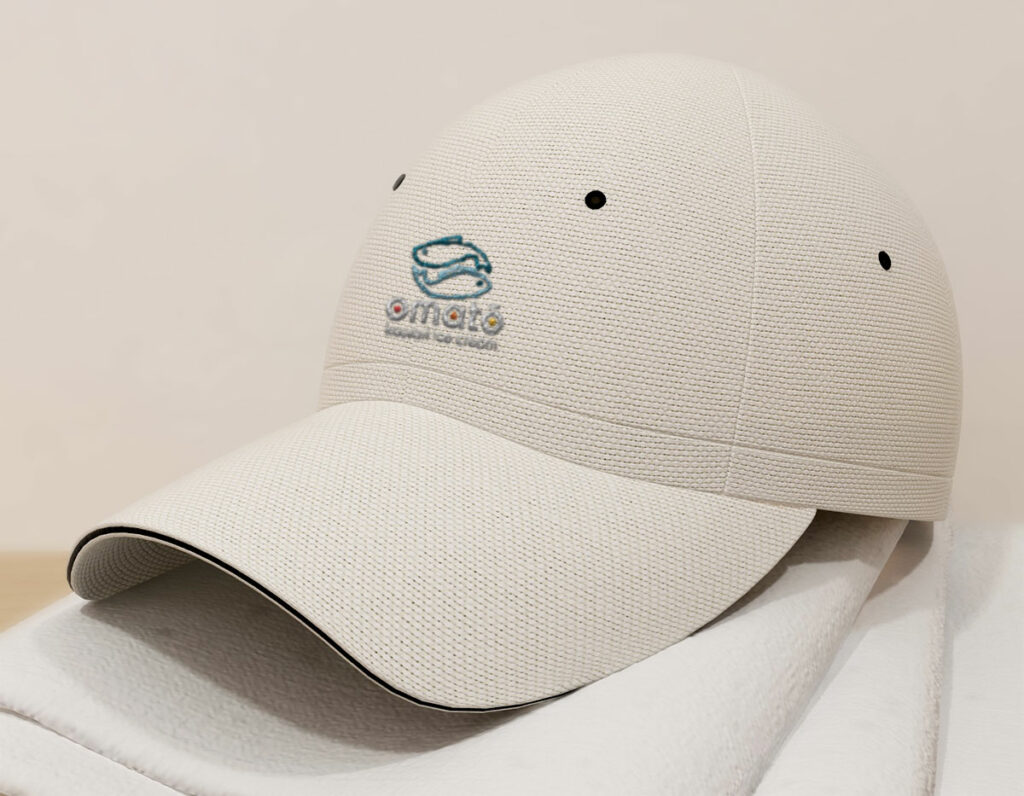
The logo goes beyond the typical koi fish yin-yang design; its shape is inspired by taiyaki, the popular fish-shaped street food in Japan, adding an extra layer of cultural charm to the brand. Plus the name Omatō (おまとう) translates to “snack” or “light meal,” perfectly reflecting the casual and imaginative spirit of this design.
Disclaimer: This work was created for a university assignment and is a fictional or conceptual project. It is not affiliated with, commissioned by, or endorsed by the brand shown.